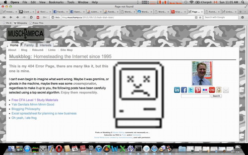
New 404 Error Page, what do you think?
September 16th, 2012
Back in 2005 when I created the WordPress theme for what became Muskblog, I didn’t spend much time on a custom 404 Error Page. Once again an upgrade to the newest version of WordPress busted either my theme or someone’s plugin or both. I got rid of the offending plugin and used some newer built into WordPress pagination code but while testing it I realized my 404 Error Page looked pretty plain.
Since I have time on my hands, some PHP skills, and years of experience messing around with WordPress I decided to copy an idea from my sidebar and add it to my 404 Error Page. Basically I just use wp_list_bookmarks to display five random blog posts from a carefully selected subset of the posts on Muskblog. This may or may not help my search engine optimization efforts. Most of the posts are cornerstone content but a few aren’t as I like a little randomness.
Once that was working and despite adding in some silly text, the 404 Error Page still looked too plain so I decided to add an image. What image says error?
The Sad Mac

I did some Googling and I found a few images but not the actual original icon file so I decided to just draw it pixel by pixel. I found an article about Susan Kare and using GraphicsConverter I redrew the icon pixel by pixel. I originally thought I needed 28 pixels for the width, but it turned out 27 was the absolute minimum width. For unknown reasons I saved it as a PNG file, perhaps because you don’t need to license that algorithm in order to use it, plus I know a thing or two about data compression. I uploaded and positioned the image, but I wasn’t sure how large to make it. I decided to let the browser resize it, to see how fast that rendered, but also how it looked. I decided to make it what I thought at first was 10 times larger or 280 pixels. The result was a happy accident, 280 pixels is about the size I was aiming for, but because the actual image was 27 pixels wide, the PNG algorithm made several guesses and approximations, the resulting blurred out image works pretty well.
Is it pixel perfect?
This post and image actually got shared on several websites. I think people may have taken my version of the Sad Mac which may be slightly different sized than the original and used it. The difference with my version may just be whitespace so when cropped and resized no one would notice. I now wonder if I should have added some color to make my Sad Mac unique.
Why does this work?
I’ve tested it in several browsers, even on my iPhone. I suspect they all might use the same royalty free PNG library. I thought about using some fancy JavaScript to resize the image, but for now I’m going to leave it rendering blurry. There is already too much JavaScript being loaded by too many plugins. In 2019 I massively overhauled my blog and removed almost every plugin in an attempt to increase WordPress page load speed.
If I switched to a vector based image file format it would render near perfectly at any size, but PNG, along with GIF and JPG are supported by just about every browser and device built since I first joined the World Wide Web plus PNG is technically superior to GIF and JPG in many ways. Drawing the sad mac icon on the fly should be possible given how simple it is. If you have any thoughts on why this happy accident works you can leave them below.
This entry was originaly posted on , it was last edited on and is filed under: Technology and tagged: Mac, PHP, Susan Kare, WordPress.


2 CommentsLeave A Comment Now